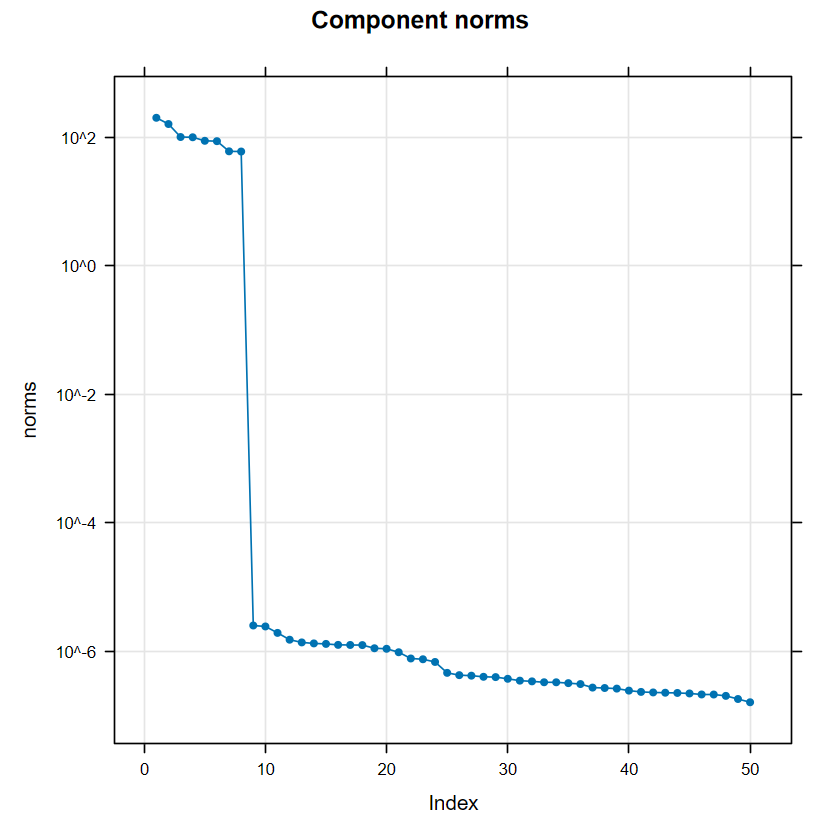
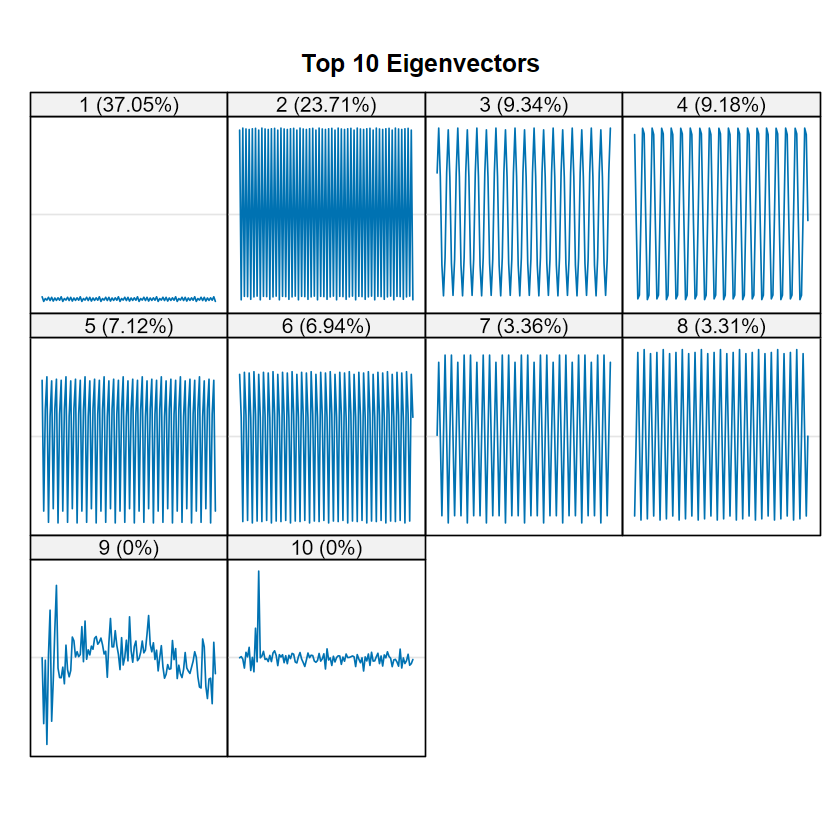
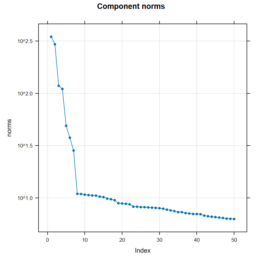
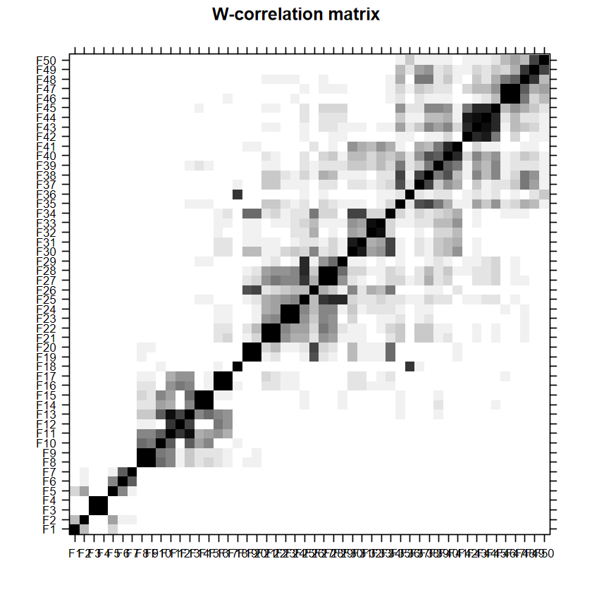
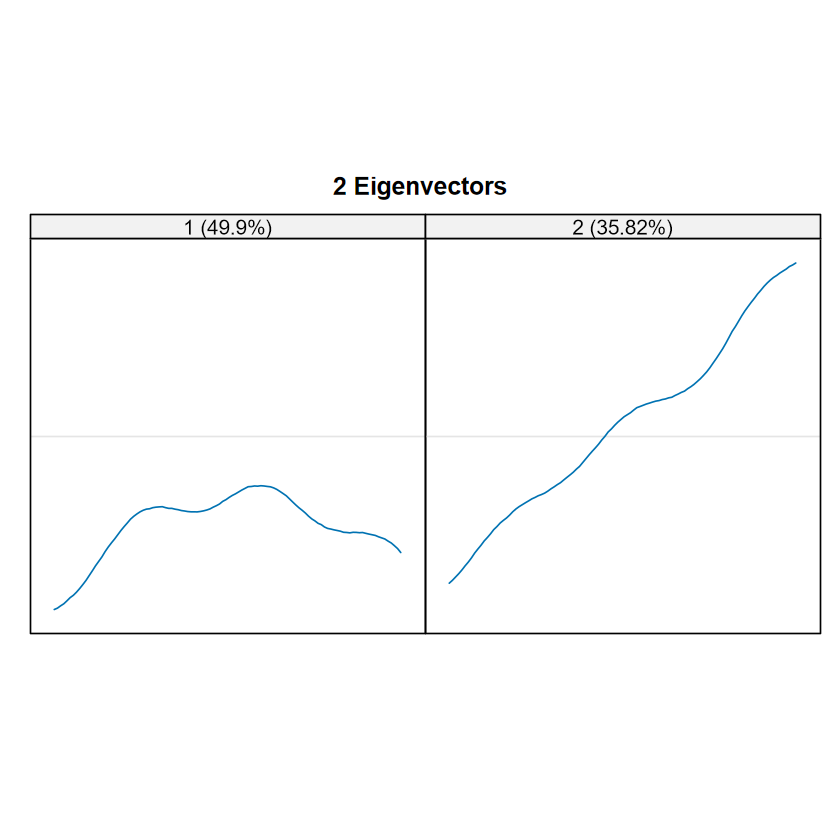
顏色越深越一致就越代表是同一群,可以觀察到整體區塊可以分成 2 個:前1-8個 components 圖片看起來很乾淨,第 9 個 lag 以後出現很多在不同區域的相關,這些即為雜訊,呼應雜訊的長相都有點不規則。
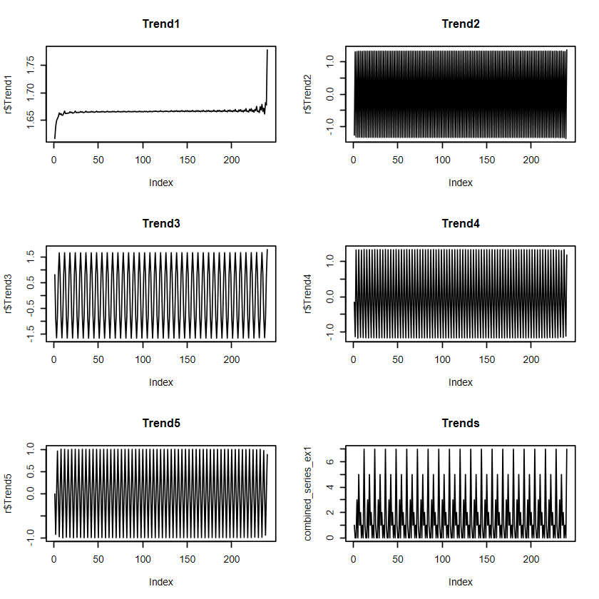
我們來利用 1-8 個 components 重建時間序列。
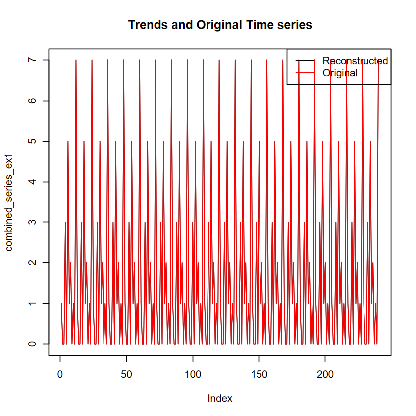
# 重建時間序列r <-reconstruct(s, groups =list(Trend1=1,Trend2=2,Trend3=3:4,Trend4=5:6,Trend5=7:8))# 畫重建後的序列par(mfrow =c(3,2))plot(r$Trend1, type ="l",main ="Trend1")plot(r$Trend2, type ="l",main ="Trend2")plot(r$Trend3, type ="l",main ="Trend3")plot(r$Trend4, type ="l",main ="Trend4")plot(r$Trend5, type ="l",main ="Trend5")combined_series_ex1 <- r$Trend1+r$Trend2+r$Trend3+r$Trend4+r$Trend5plot(combined_series_ex1, type ="l",main ="Trends")par(mfrow =c(1,1))plot(combined_series_ex1, type ="l",main ="Trends and Original Time series")# 疊加原始序列lines(y, col ="red")# 加上圖例legend("topright",legend =c("Reconstructed", "Original"),col =c("black", "red"), lty =1)
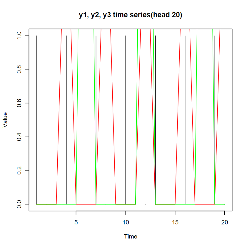
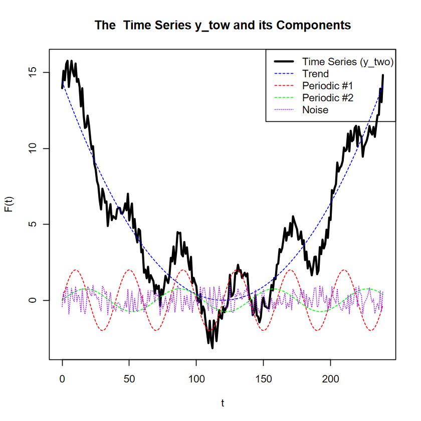
# The number of time 'moments'N <-240# Time indext <-0:(N -1)# Componentstrend <-0.001* (t -120)^2p1 <-40p2 <-70periodic1 <-2*sin(2* pi * t / p1)periodic2 <-0.75*sin(2* pi * t / p2)# Set seed for reproducibilityset.seed(123)# Generate noisenoise <-2* (runif(N) -0.5)# Final time seriesy_two <- trend + periodic1 + periodic2 + noise# Plotplot(t, y_two, type ="l", lwd =2.5,xlab ="t", ylab ="F(t)",main ="The Time Series y_tow and its Components")lines(t, trend, col ="blue", lty =2)lines(t, periodic1, col ="red", lty =2)lines(t, periodic2, col ="green", lty =2)lines(t, noise, col ="purple", lty =3)legend("topright",legend =c("Time Series (y_two)", "Trend", "Periodic #1", "Periodic #2", "Noise"),col =c("black", "blue", "red", "green", "purple"),lty =c(1, 2, 2, 2, 3),lwd =c(2.5, 1, 1, 1, 1))
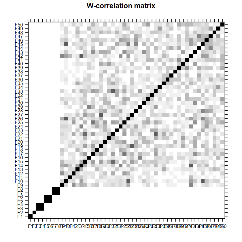
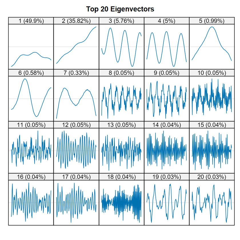
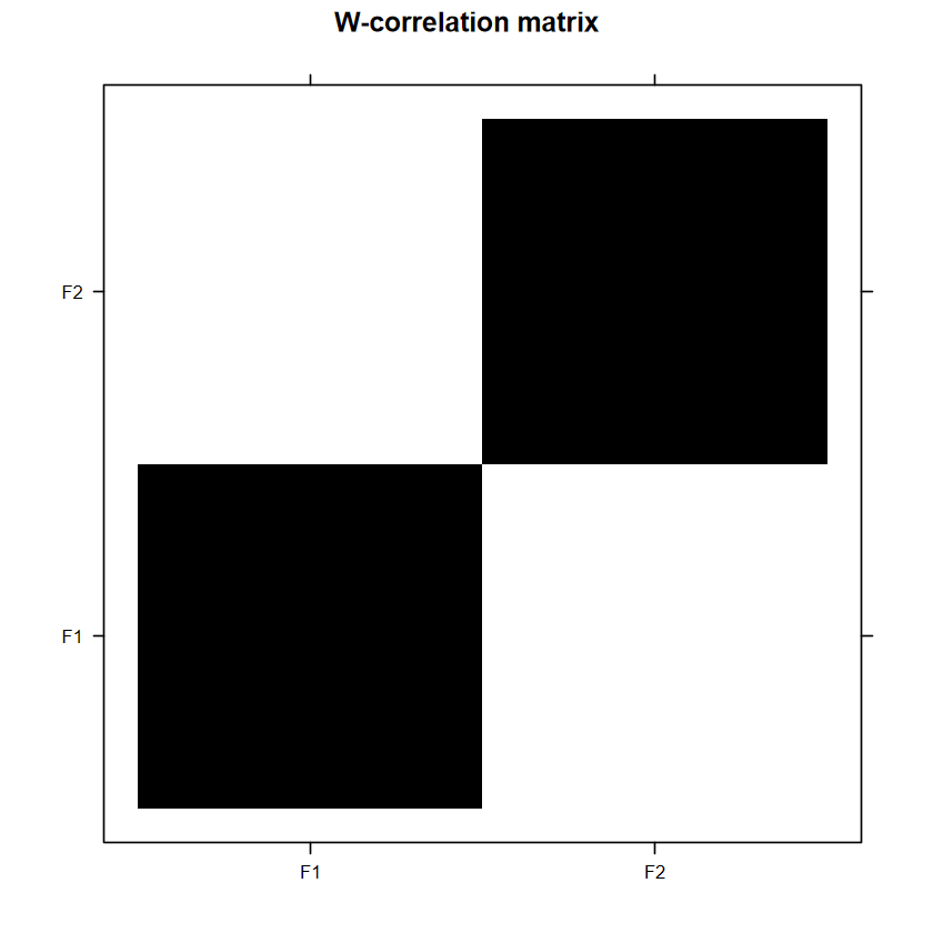
方塊顏色越深表示越有相關,如果 window length \(L\) 設得較好,理想情況屬於訊號的部分應該要盡量只有自己跟自己(如 F1 跟 F1)顏色最深,其他都是淺的 。以這裡來說,可以看到 F1 與 F2那裡只有自己顏色最深,可以選為 trend;F3 與 F4 顏色一樣深且最深,可以視做同一個 component;F5 與 F6 類似 F1 與 F2 的情況,但他們之間的關係度稍高,考慮到前面還有 1% 左右的占比,視做同一個 component,列入訊號中;之後的東西除了因為占比少,不同區域的方塊顏色也是不規則分布。
因此這樣猜測:
F1 與 F2 為trend
F3 與 F4 為週期 1
F5 與 F6 為週期 2
其他視作雜訊
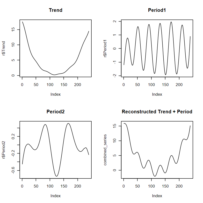
我們利用 reconstruct() 執行前面提過的 LRF 演算法,重建時間序列。
# 重建時間序列r <-reconstruct(s, groups =list(Trend =1:2, Period1 =3:4,Period2 =5:6))# r 裡面會有Trend, Period1, Period2 , original time series 等多維度資料,不建議直接用plot(r)# 分開畫par(mfrow =c(2,2))plot(r$Trend, type ="l",main ="Trend")plot(r$Period1, type ="l",main ="Period1")plot(r$Period2, type ="l",main ="Period2")combined_series <- r$Trend + r$Period1 + r$Period2plot(combined_series, type ="l", main ="Reconstructed Trend + Period")# plot(r$Rest, type = "l",# main = "Remain")
右下角即是重建後的時間序列,跟原本的資料相比:
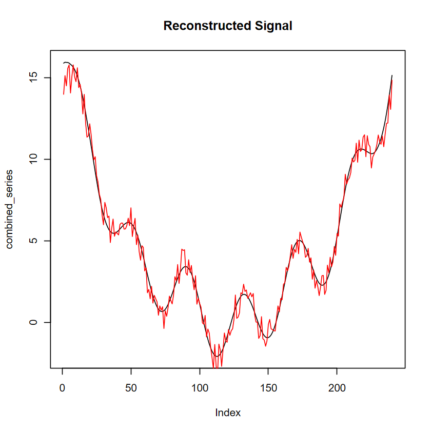
plot(combined_series, type ="l", main ="Reconstructed Signal")lines(y_two,col="red") # 紅線為原始資料
SSA by itself does not result in better forecasting accuracy. The reason is that some signal from the time series might not be captured by the components that we select (if we select too few components), or that the signal might include some noise (if we select too many components).
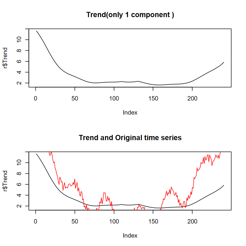
# 重建時間序列# 只選一個 componentr <-reconstruct(s, groups =list(Trend =1))# 分開畫par(mfrow =c(2,1))plot(r$Trend, type ="l",main ="Trend(only 1 component )")plot(r$Trend, type ="l",main ="Trend and Original time series")lines(y_two, col="red")
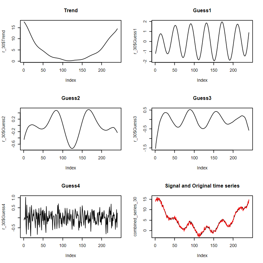
這個例子驗證了 component 選太少作為訊號的問題。如果是選太多:
# 重建時間序列# 選30個 componentr_30 <-reconstruct(s, groups =list(Trend =1:2, Guess1=3:4,Guess2=5:6, Guess3=6:7,Guess3=8:9, Guess4=10:30 ))# 分開畫par(mfrow =c(3,2))plot(r_30$Trend, type ="l",main ="Trend")plot(r_30$Guess1, type ="l",main ="Guess1")plot(r_30$Guess2, type ="l",main ="Guess2")plot(r_30$Guess3, type ="l",main ="Guess3")plot(r_30$Guess4, type ="l",main ="Guess4")combined_series_30 <- r_30$Trend + r_30$Guess1 + r_30$Guess2 +r_30$Guess3+ r_30$Guess4plot(combined_series_30 , type ="l",main ="Signal and Original time series")lines(y_two, col="red")
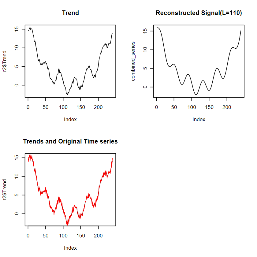
# 重建時間序列r2 <-reconstruct(s2, groups =list(Trend =1))# r 裡面會有Trend, Period1, Period2 , original time series 等多維度資料,不建議直接用plot(r)# 分開畫par(mfrow =c(2,2))plot(r2$Trend, type ="l",main ="Trend")plot(combined_series, type ="l", main ="Reconstructed Signal(L=110)")plot(r2$Trend, type ="l",main ="Trends and Original Time series")lines(y_two,col="red") # 紅線為原始資料
Tianze Wang, Sofiane Ennadir, John Pertoft, Gabriela Zarzar Gandler, Lele Cao, Zineb Senane, Styliani Katsarou, Sahar Asadi, Axel Karlsson, Oleg Smirnov. (2025). Frequency Matters: When Time Series Foundation Models Fail Under Spectral Shift. https://arxiv.org/abs/2511.05619